Blog
There is a very simple reason why your website needs to be mobile friendly – in the last five years, the number of smart phone users has tripled – now approaching 200 million in a country with a population of 319 million - and those users are increasingly accessing the internet via their mobile device.
In the USA, 94% of people with smartphones search for local information on their phones. Interestingly, 77% of mobile searches occur at home or at work, places where desktop computers are likely to be present. Source: Google.com
Overseas, internet access is increasingly mobile, driven by economics. An $80 smart phone is a lot less expensive than a $800 laptop and a lot easier to carry.
Responding to the growth of mobile access, in April 2015, Google rolled out a new mobile-friendly requirement to its search algorithm. Google's mobile-friendly criteria are actually pretty basic. A site must have: text that's readable without zooming, links far enough apart to tap and an absence of Flash.
This does not mean your firm will not come up when someone searches for it by name on a smart phone. Your url is still going to be the top result if the search terms match, however, if the search is for an "investment advisor, your town, your state," an advisor with a mobile-friendly site in your town is going to have priority.
The problem with a non-mobile-friendly site is that someone who visits your site via a mobile device is going to have a harder time finding the information they are looking for and probably won't stay on the site for long.
So what should you do?
(1) Look at your site on your phone. Is it functional?
(2) Take Google's Mobile Friendly Test - https://www.google.com/webmasters/tools/mobile-friendly/
(3) Find out if your site can be adapted to a mobile-friendly format. Goggle has some very helpful advice that's going to come up after you run your mobile-friendly test. Changes in font size, navigation, etc. may make your site easier to view on a mobile device.
(4) Convert to a mobile-friendly site.
There are currently two levels of mobile-friendly sites. Responsive and Adaptive. "Currently" because at the rate of change in this industry, next few years could offer a new array of options.
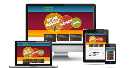
A Responsive site adjusts to the viewing device. It is designed to be functional on screens from desktop monitors and tablets to a smart phone. The site layout is broken into blocks that rearrange themselves based on the device used to access the page.
An Adaptive site adds a little rocket science to the site by adjusting the structure, content, or presentation of information in response to measured user interaction with the site, with the objective of optimizing future user interactions. Adaptive websites learn from user access patterns. Those patterns may be collected directly on the website or "mined" from web-based data and are used as the basis for tailoring the website for known and specific patterns of user interaction. Some of the most popular applications of Adaptive sites are retail, food, hospitality, insurance, and sales sites.
Is there a place for adaptive sites in the investment advisor industry? Absolutely. A client could be automatically redirected to the page most frequently visited. A first-time visitor might encounter a different landing page than a frequent visitor. Specific investment strategies may be presented…the options are limited only by the available data and the site owner's imagination. For now, cost may limit the use of adaptive sites. But if this is an avenue you are interested in exploring, a visit to www.moovweb.com might be of value.
Converting to a mobile site typically requires building a new site. This can actually be very beneficial when site owners have let their content get a little stale. It's an opportunity to reassess the information you are presenting on your site, whether it still fits your objectives, strategies and clients, and makes the impression you want.
One recommendation I make when companies are looking at redesigning their sites is to start by looking at templates. Templates will save you tremendous time and money by minimizing the design stage and taking some of the unknown out of the final result. Web sites from scratch can be a crap shoot if you don't have the right designer who knows mobile-friendly coding.
If you are working with a financial advisor site provider, make certain you are looking at responsive templates. Know what they look like on a mobile device, and build your content based on the information you want to dominate on a mobile screen.
If you want a site that you control from design to hosting, there are a number of template sites online from Wordpress to html5 and other formats. Just make certain the template you like is responsive. You are looking for layouts, colors, image and text styles that will work well for your firm. When you find something that looks good, put it through its paces and see how the site will look and function on a desktop monitor, tablet, smart phone, etc. Someday, you could well need a site that works on a smart watch as well, but the adaption curve is still probably five years out on that one.
You can also browse the web for free responsive templates, but free makes me very nervous. "Free" is too often a bait that comes with malware.
When it comes to selecting a design for your site, don't stop with the home page. Look at inside page layouts in their respective desktop, tablet and mobile variations. Will the information you want to present fit those layouts? Fonts, colors, artwork, photographs and copy can all be easily changed once you find a template you like. Layouts are not as easily changed, particularly when taking into account the need for the layout to adjust to different viewing sizes.
Once you find the design you like, develop/adapt/customize your copy to fit the design. When you know what each page will say, it can be pretty quick to actually roll in new copy and images. But, don't forget to make Search Engine Optimization (SEO) part of the process. SEO asks "Is the site content relevant to the search terms? Is it fresh (i.e. has it been updated on a regular basis)?" Relevant content needs to be supported by good page titles, page descriptions, alt descriptions, headers and subheaders, and urls that build keyword density. It's easiest to incorporate these features as the site is developed, rather than going back in to add them later.
Remember it isn't enough to just provide information on your website, you also have to ASK FOR THE VISITOR'S BUSINESS. Have a tool to collect your visitors' emails. And have a plan to follow up with every email you collect, not just this week but for months and possibly years into the future.
Linda Ferentchak has created websites for clients for more than 12 years and has taken several client websites mobile. Additional mobile-friendly versions of her sites can be found at www.activemanagersresource.com and www.thoughtful-investor.com